Wow, it's been a few days since any activity here!
As some may recall, last time I was on this thread I was trying to tear CFHollister a new one, olde schoole style. (Not really. Again I apologize to CFH! He's a gentleman and a scholar, and he got that I was only about 1/10th serious there) (so I guess I'm summarizing this in case anyone else thought I was more earnest than that...) CFH, again, here's to you!
As far as voting goes, I'd happily vote today for
The Alizée America Logo exactly as it is, in Ruroshen's latest incarnations. It's beautiful, simple, got nice primary colors-- what more do you want?
Okay, one more thing we might want...
>> How about a monochromatic version? << Just black on white, and maybe it could be reversed for white ink on black t-shirts or hats. Otherwise, color printing on black gets more challenging. Also more expensive. If it's a smaller, pocket-size or hat-size printing, full-color will certainly look quite sharp, but more economical alternatives can have almost as much appeal.
(Actually, I suppose a monochrome version would be best developed AFTER the final color version is chosen. So this suggestion is kinda early. But just thought I'd mention, to see if I was the only one thinking that or not.)
So there! I think a lot of us are ready to vote, because we've already got a winner!
That much being said,
NOW SOME IDEAS FOR NEXT YEAR'S VERSION: (XP)
At some point in the future, I'd like to see more flags on there. I've said it before, now I've said it some more. Because we're international. And so is Alizée.
Also, I previously said I was concerned about using the Psychedélices "A" because it might be copyrighted.
Well,
Not that I'm lobbying,
but I've got three other
teensy little probs with that "A". So I'm just going to say 'em, cause I can't seem to shut up now.
1.) It's rather feminine. Not that there's anything wrong with that.
2.) "The Scarlet Letter". Big Red A. That`s all.
and -
3.) Here's a good one: in just a few weeks, that "A" will be the symbol from the
old album! In all likelihood, she'll have moved on.........
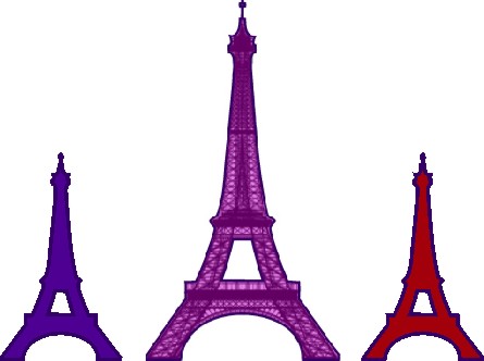
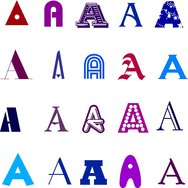
Okay, I'll shut up now. But here's some other A's. Just to look at. Some bad. Some less bad. The Eiffels are supposed to look like A's too. They don't. I know.
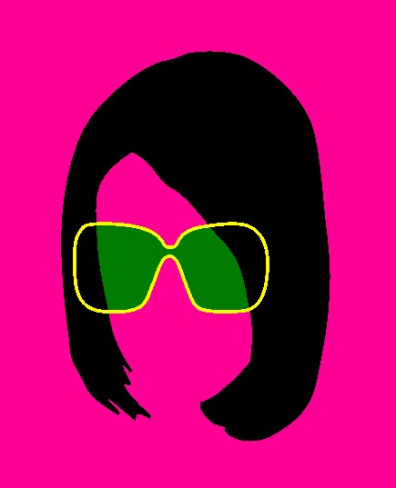
And, for those who liked the "hairdo" thing, but wanted to see her with sunglasses, well i tried a few different kinds. The results are pretty good, but none of 'em look anything like a letter "A" anymore. So I'm gonna keep doing something with those, I'm thinking a printable sticker sheet could be neat.
But here's one of the experiments, perhaps looking a little Warholesque. (Hey, if the new disc really IS about Edie, that may be an effective marketing approach to exploit ) ?.?.?..

")
- Ch.