
|
#131
 02-21-2009, 08:59 PM
|
||||
|
||||
|
Looks like we may not need donations after all, thanks to Bladegear's super generous offer to print the banner for free! Shipping might still be an issue, depending on if I can take it aboard a plane or not, but I'll try to cover that myself.
So are we in agreement about the text? Could a native speaker confirm the French? Not that there's much room for errors, but I'd just like to be 200% sure before finalizing the design and sending it off to Bladegear. Thanks everyone!  Last edited by Ben; 02-21-2009 at 09:27 PM.. 
|
|
#134
02-22-2009, 12:17 AM
|
||||
|
||||
|
Quote:
__________________
 Merci Fanny
|
|
#137
02-22-2009, 02:56 AM
|
||||
|
||||
|
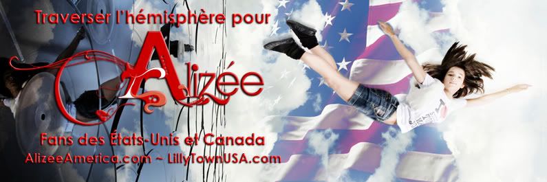
Sweet Looks great. I'd ask the printer how he thinks it will look at the size you're thinking of though.
I wonder if it could use a little more contrast on the lettering; so, maybe a white shadow instead of black? So, she's flying to the US... though it does look more like falling. I think it communicates.
__________________
Merci Fanny
|
|
#138
02-22-2009, 02:57 AM
|
||||
|
||||
|
Very nice, Ben! I think it achieves exactly what you were looking for.
The only suggestion I have would be to maybe put a bit more space between the URLs, or break them up with a bullet point or a simple graphic of some kind. Otherwise it's perfect. Well done, sir. Please don't hesitate to let me know if you want/need any help with shipping costs, or whatnot. 
__________________
|
|
#139
02-22-2009, 03:16 AM
|
|||
|
|||
|
Quote:
 !? whoa this one is very cool Ben, nice job indeed !? whoa this one is very cool Ben, nice job indeed  . I just want to point out something, I wonder if that red color (in the website's links) will be easily readable and visible to people at a certain distance . I just want to point out something, I wonder if that red color (in the website's links) will be easily readable and visible to people at a certain distance  ? ? Well, I guess there is no better color that can fit on the banner's design than red . Just my thoughts.Again, nice design
|
 |
|
|


 Linear Mode

