
|
#151
 08-29-2009, 11:35 PM
|
||||
|
||||
|
im ready to vote! hopefully the awesome designers are close to wrapping up their creations. thank you guys so much, your work is greatly appreciated.
 
|
|
#153
09-03-2009, 05:12 AM
|
||||
|
||||
|
Wow, it's been a few days since any activity here!
As some may recall, last time I was on this thread I was trying to tear CFHollister a new one, olde schoole style. (Not really. Again I apologize to CFH! He's a gentleman and a scholar, and he got that I was only about 1/10th serious there) (so I guess I'm summarizing this in case anyone else thought I was more earnest than that...) CFH, again, here's to you! As far as voting goes, I'd happily vote today for The Alizée America Logo exactly as it is, in Ruroshen's latest incarnations. It's beautiful, simple, got nice primary colors-- what more do you want? Okay, one more thing we might want... >> How about a monochromatic version? << Just black on white, and maybe it could be reversed for white ink on black t-shirts or hats. Otherwise, color printing on black gets more challenging. Also more expensive. If it's a smaller, pocket-size or hat-size printing, full-color will certainly look quite sharp, but more economical alternatives can have almost as much appeal. (Actually, I suppose a monochrome version would be best developed AFTER the final color version is chosen. So this suggestion is kinda early. But just thought I'd mention, to see if I was the only one thinking that or not.) So there! I think a lot of us are ready to vote, because we've already got a winner! That much being said, NOW SOME IDEAS FOR NEXT YEAR'S VERSION: (XP) At some point in the future, I'd like to see more flags on there. I've said it before, now I've said it some more. Because we're international. And so is Alizée. Also, I previously said I was concerned about using the Psychedélices "A" because it might be copyrighted. Well, Not that I'm lobbying, but I've got three other teensy little probs with that "A". So I'm just going to say 'em, cause I can't seem to shut up now. 1.) It's rather feminine. Not that there's anything wrong with that. 2.) "The Scarlet Letter". Big Red A. That`s all. and - 3.) Here's a good one: in just a few weeks, that "A" will be the symbol from the old album! In all likelihood, she'll have moved on......... Okay, I'll shut up now. But here's some other A's. Just to look at. Some bad. Some less bad. The Eiffels are supposed to look like A's too. They don't. I know.  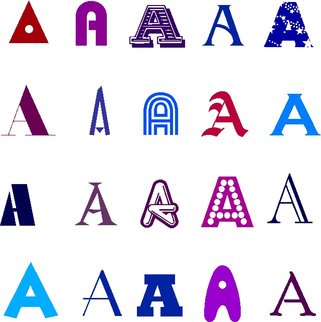 And, for those who liked the "hairdo" thing, but wanted to see her with sunglasses, well i tried a few different kinds. The results are pretty good, but none of 'em look anything like a letter "A" anymore. So I'm gonna keep doing something with those, I'm thinking a printable sticker sheet could be neat. But here's one of the experiments, perhaps looking a little Warholesque. (Hey, if the new disc really IS about Edie, that may be an effective marketing approach to exploit ) ?.?.?.. 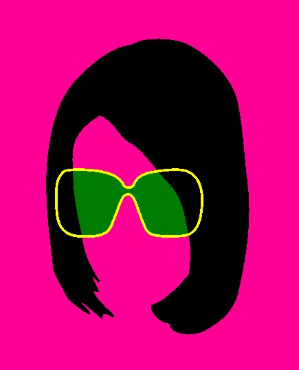  ") - Ch. - Ch.
|
|
#154
09-03-2009, 07:13 AM
|
||||
|
||||
|
I like the hair one but I think the sunglasses are unnecessary
__________________
Be the leaf.
|
|
#155
09-03-2009, 09:50 AM
|
||||
|
||||
|
Thanks, Jalen. Actually, the hair thing will probably reappear somewhere else soon*, but I just brung it here for show-an-tell. It's got nothing at all to do with this logo any more, as far as I'm concerned.
As for saying "Warholesque" above, yes, I am full of it. I'm sorry. But I do have a rough version with 16 hairpieces on an 8-1/2 x 11 size - each a bit different - and it reminded me of warhol's Marilyn and Mao prints, that's why I was thinking that. quoting my earlier submission: (Hey, if the new disc really IS about Edie, that may be an effective marketing approach to exploit ) ?.?.?.. * ...Intending a lot, but not saying very much, I Babylon. But it's made me wonder some more. Why the connection, why Lilly's attraction to the sad and amazing life of Edie Sedgwick? And I think I've come up with some insights that I'm just gonna hafta post as a new essay soon. So for now I'll shut up and skedaddle again. * re: reappearing hair, exploitative marketing This is another idea to post elsewhere, too, like under promotions. So I'm goin do that. Later.
|
|
#156
09-03-2009, 11:23 PM
|
|||
|
|||
|
ok, i think someone (*coughcough* Ben *coughcough*) should take charge, set up a deadline for everyone who wants to to contribute, and then we can vote on it.
seriously, i really do want many a Alizee apparel. as in, when me and my buddies go out to eat, i usually stick with an appetizer to save money so i can spend it on Alizee material, especially with the new album coming out! LOTS OF COOL STUFF BY THEN!  and i say Ben cuz.. well, he knows how get things done around here! 
__________________
 
|
|
#157
09-04-2009, 12:24 AM
|
||||
|
||||
|
Quote:
this all sounds so familiar...http://alizeeamerica.com/forums/show...ghlight=shirts http://alizeeamerica.com/forums/show...ghlight=shirts http://alizeeamerica.com/forums/show...ghlight=shirts http://alizeeamerica.com/forums/show...ghlight=shirts http://alizeeamerica.com/forums/show...ghlight=shirts http://alizeeamerica.com/forums/show...ghlight=shirts http://alizeeamerica.com/forums/show...ghlight=shirts ...And all this time I thought we already had a logo. I swear i've seen it somewhere on the forum. Probably on every page Seriously though I think we have dragged this idea through the dirt. Beat it with a stick, then dragged it some more 
|
|
#158
09-04-2009, 12:36 AM
|
||||
|
||||
|
Quote:
 Same! Plus now that I'm starting senior year, im going to make new friends to introduce Mademoiselle Lovely to, and the school is going to have us do a bunch of leadership and community stuff and im going to go all over the place: hopefully promoting Alizeé along the way! Same! Plus now that I'm starting senior year, im going to make new friends to introduce Mademoiselle Lovely to, and the school is going to have us do a bunch of leadership and community stuff and im going to go all over the place: hopefully promoting Alizeé along the way!ps. i was gonna say Miss Lovely but Mademoiselle just came to me immidately
|
|
#159
09-04-2009, 12:42 AM
|
|||
|
|||
|
Quote:
good point my friend... however, there is only one flaw: i had yet to be bitten by the lilly bug at the time those votes were taken! im here now, so lets stop dragging the idea, and freaking catapult it into the sky!
__________________
|
|
#160
09-04-2009, 02:33 AM
|
||||
|
||||
|
Quote:
Dang and i thought we were being a little indecisive about it now, this has been discussed for years! But at least now the excitement about the new album will help us to get this thing going
|
 |
|
|


 Linear Mode

