
|
#1
 03-25-2009, 10:39 PM
|
|||
|
|||
|
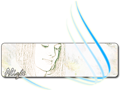
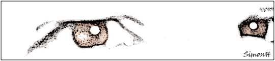
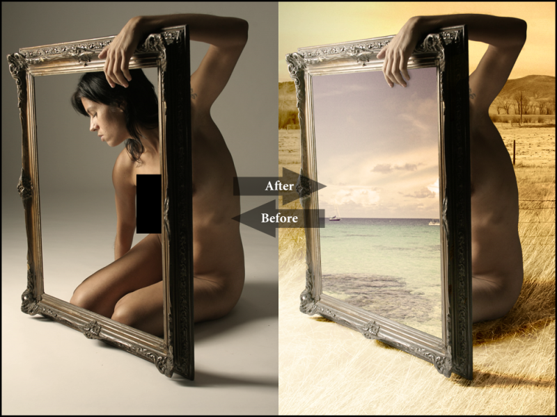
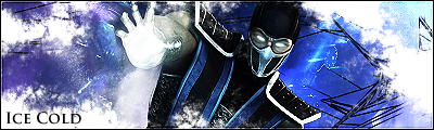
Will share some of my favorite PS CS4 work here. Note, these are not the same images that Plaz saw and commented,
Quote:
__________________
 Last edited by SimonH; 07-25-2009 at 07:34 AM.. 
|
|
#2
03-26-2009, 09:28 PM
|
||||
|
||||
|
Nice man u got some tallent. I like them all.
|
|
#3
03-26-2009, 11:19 PM
|
|||
|
|||
|
They are ok
|
|
#6
03-28-2009, 08:39 PM
|
|||
|
|||
|
Quote:
Edit: In my opinion, your two are worse then the Alizee ones I had up even before. You should take your own advice. :P
__________________
Last edited by SimonH; 03-28-2009 at 08:48 PM..
|
|
#7
03-28-2009, 09:52 PM
|
|||
|
|||
|
Quote:

|
|
#8
03-28-2009, 11:00 PM
|
|||
|
|||
|
Your a tough critic, but it is all good. I appreciate your honesty. To one person a painting is a masterpiece; to another, it is a piece of junk. To each their own I guess. :P
My goal is now to create something you really like lol. Got any ideas on a theme?
__________________
|
|
#10
03-29-2009, 08:26 PM
|
||||
|
||||
|
Quote:
anyways man even with your new post edit their still really low level... but as i said your getting the idea with depth and flow.. also please before judging my sigs do ask to actually see some of my work before making an assessment on the two I'm using
__________________
 --------------------------------------------------- 
|
 |
|
|


 .
. Linear Mode

