Go Back   Alizée America Forum > Alizée > Alizée Fan Art

Reply
 
Thread Tools Display Modes
  #21  
Old 08-08-2009, 02:10 AM
Ben's Avatar
Ben Ben is offline
Century Child
 
Join Date: Jun 2006
Location: NYC
Age: 40
Posts: 2,905
Ben is on a distinguished road
Default

Quote:
Originally Posted by Ruroshen View Post
OK, that's one vote for the flag-size in version 4. I could go either way, myself. Anyone else have a vote before I start work on the next pass tomorrow?
I like both. Just looking at it I like the larger flags more, but then I get CFH's point about fitting the design in a circle. So I guess it would depend what we're using this for. I'd say go with #4 for now.
Reply With Quote
  #22  
Old 08-08-2009, 02:33 AM
Ruroshen's Avatar
Ruroshen Ruroshen is offline
Hello, Lilly Town people
 
Join Date: Jun 2008
Location: Toronto, Canada
Posts: 1,297
Ruroshen is on a distinguished road
Default

Quote:
Originally Posted by Ben View Post
I like both. Just looking at it I like the larger flags more, but then I get CFH's point about fitting the design in a circle. So I guess it would depend what we're using this for. I'd say go with #4 for now.
Well, I can actually keep updating both without too much trouble, honestly. It feels like we've got the basic design down now, and it's all going to be fiddly bits from this point on.

I'd be lying if I said I didn't see a practical application for this (*cough*T-shirts!*cough*), but I honestly did start this just because I thought CFH's description was really cool, and I wanted to see if it could work visually. I just love the symbolism of it. The Liberty torch especially is a touch of genius.

Wish I could work a maple leaf in there, too...but enh, you work with whatcha got.
__________________
Reply With Quote
  #23  
Old 08-08-2009, 02:34 AM
TheBarrett's Avatar
TheBarrett TheBarrett is offline
Faded into Gray
 
Join Date: May 2008
Posts: 3,508
TheBarrett is on a distinguished road
Default

Quote:
Originally Posted by Ruroshen View Post
Well, I can actually keep updating both without too much trouble, honestly. It feels like we've got the basic design down now, and it's all going to be fiddly bits from this point on.

I'd be lying if I said I didn't see a practical application for this (*cough*T-shirts!*cough*), but I honestly did start this just because I thought CFH's description was really cool, and I wanted to see if it could work visually. I just love the symbolism of it. The Liberty torch especially is a touch of genius.

Wish I could work a maple leaf in there, too...but enh, you work with whatcha got.
Hey you know, you're a smart-aleck, you can screw one in the block somehow.
__________________
"I will write Peace on your wings, and you will fly all over the world."
Reply With Quote
  #24  
Old 08-08-2009, 03:16 AM
CFHollister's Avatar
CFHollister CFHollister is offline
Fan d'Alizée (pour toujour)
 
Join Date: Nov 2006
Location: Buckley, WA (USA)
Age: 42
Posts: 2,345
CFHollister is on a distinguished road
Default

Quote:
Originally Posted by Ruroshen View Post
Wish I could work a maple leaf in there, too...but enh, you work with whatcha got.
Well the way I see it, you have a couple of options:
1) You can do another variation with a Canadian flag instead of the USA one.

2) You can turn the balls on top of the flagpoles you don't like that much in small black maple leaves (or maybe even read ones outlined in black).


There's also a very much more complicated tack you can take, but you might take that on as a separate project after you feel you're done with this one...
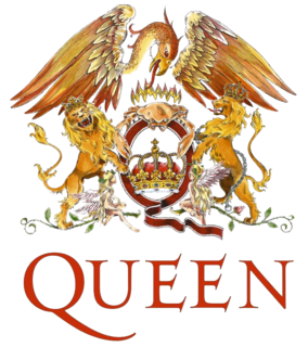
You can imagine a Mexican eagle, wings outstretched, over all clutching a pair of maple leaves. Also, dolphins (Alizée's favorite) supporting (rather in the positions of the lions in the Queen "crest") and also the traditional title given to the heir apparent to the throne of France (). Anyway just an idea for continuation of this project (but really a separate one)
__________________
C'est ta faute... mais on t'aime quand même, Alizée!
Tu m'as pris dès le premier "moi."

Last edited by CFHollister; 08-08-2009 at 03:21 AM..
Reply With Quote
  #25  
Old 08-08-2009, 05:16 AM
Rev's Avatar
Rev Rev is offline
Senior Member
 
Join Date: May 2007
Location: Floating on the web.
Posts: 2,850
Rev is on a distinguished road
Default

On a shirt, you could add a phrase such as "France's gift to America" or similar.
__________________
--- pace e salute ---
Reply With Quote
  #26  
Old 08-08-2009, 08:55 AM
Toc De Mac's Avatar
Toc De Mac Toc De Mac is offline
Paris féerique
 
Join Date: Jun 2007
Posts: 1,367
Toc De Mac is on a distinguished road
Default

Ruroshen, that design is awesome. Definitely t-shirt worthy material.

__________________
D'où est, d'où vient l'homme, petit marcheur dans le réel?

Reply With Quote
  #27  
Old 08-08-2009, 10:00 AM
jung_adore_ALIZEE's Avatar
jung_adore_ALIZEE jung_adore_ALIZEE is offline
D[e]mon of the Fall
 
Join Date: Mar 2008
Location: my house
Age: 35
Posts: 2,619
jung_adore_ALIZEE is an unknown quantity at this point
Default

as a side note if it will go on a shirt make sure the image is at least 1600X1200 bigger is still preferred a smaller image would work fine for a breast pocket cover or such but for a full back more pixels is better
__________________


Reply With Quote
  #28  
Old 08-09-2009, 12:31 AM
Ruroshen's Avatar
Ruroshen Ruroshen is offline
Hello, Lilly Town people
 
Join Date: Jun 2008
Location: Toronto, Canada
Posts: 1,297
Ruroshen is on a distinguished road
Default

Quote:
Originally Posted by jung_adore_ALIZEE View Post
as a side note if it will go on a shirt make sure the image is at least 1600X1200 bigger is still preferred a smaller image would work fine for a breast pocket cover or such but for a full back more pixels is better
Ah OK, good to know. I've been working almost that big, but not quite--about 1500X1100. Thanks.

Alright, here we go with round 6. So far I've just updated the "super-sized" flags version, but I can do the other one later once we've decided on a few minor things, here.

What I've changed: deepened the red on the French flag to match the US, and moved the "balls" from the top of the masts to the bottom, which I think looks cleaner. Also changed the logo back to being side-by-side, and pumped up the size of "Alizée" a touch (while reducing the size of "America to make room).

I didn't touch the flame at all on this pass, but for your consideration, here's a few different color options for the "A" to help it stand out more:


Let me know what you think works best.

It feels like we're pretty close, here. Thanks again for all your feedback, guys!
__________________

Last edited by Ruroshen; 08-09-2009 at 12:33 AM..
Reply With Quote
  #29  
Old 08-09-2009, 12:36 AM
TheBarrett's Avatar
TheBarrett TheBarrett is offline
Faded into Gray
 
Join Date: May 2008
Posts: 3,508
TheBarrett is on a distinguished road
Default

I really like number 2, with the Red "A"
It just seems proper in the fire, warm colors complement each other, yet the red is dark enough to make it visible.
__________________
"I will write Peace on your wings, and you will fly all over the world."
Reply With Quote
  #30  
Old 08-09-2009, 02:33 AM
Rev's Avatar
Rev Rev is offline
Senior Member
 
Join Date: May 2007
Location: Floating on the web.
Posts: 2,850
Rev is on a distinguished road
Default

As much as I would like to see an Orange version, let me suggest that you stick with the A being a color already present elsewhere on the design.
__________________
--- pace e salute ---
Reply With Quote
Reply


Posting Rules
You may not post new threads
You may not post replies
You may not post attachments
You may not edit your posts

BB code is On
Smilies are On
[IMG] code is On
HTML code is Off

Forum Jump


All times are GMT -4. The time now is 05:24 PM.