
|
|
|
#1
 08-08-2009, 01:39 AM
|
||||
|
||||
|
Yeah, I can understand about the flag positions... in a 2D logo format like this I guess it might be more important to deliver on the eye's expectations for the flags to look "right" despite where the hoist is. One more tweak to the French flag would be to darken the red to match the stripes in the US flag; as it it looks slightly pink.
I like the bigger flags but not the supersized so much. On version 4 it looks like the whole thing could still be framed by a circle if you went that far; where the supersized flags push it out to the sides overall so that it would have to be framed by an ellipse. I still prefer "Alizée America" in a single line. Stacked doesn't necessarily look bad, but "Alizée" looks smaller, but I think it might be an optical illusion. I know Ben mentioned even making "America" bigger, but I like to make sure that Alizée remains prominent. I like the resized flame; looks good. I also like the outlining in grey, very much; it's a solid compromise. I understand about the color of the 'A'; it does blend rather well with the flame. I'm just concerned that it doesn't blend too well, such that at some distance that the 'A' isn't distinct enough to be seen clearly... Perhaps darkening it a little?
__________________
C'est ta faute... mais on t'aime quand même, Alizée!
Tu m'as pris dès le premier "moi." Last edited by CFHollister; 08-08-2009 at 01:58 AM.. 
|
|
#2
08-08-2009, 02:07 AM
|
||||||
|
||||||
|
Quote:
Quote:
Quote:
 Quote:
Quote:
Thanks for all your input, guys. This is fun! 
__________________
|
|
#3
08-08-2009, 02:10 AM
|
||||
|
||||
|
Quote:
|
|
#4
08-08-2009, 02:33 AM
|
||||
|
||||
|
Quote:
I'd be lying if I said I didn't see a practical application for this (*cough*T-shirts!*cough*), but I honestly did start this just because I thought CFH's description was really cool, and I wanted to see if it could work visually. I just love the symbolism of it. The Liberty torch especially is a touch of genius. Wish I could work a maple leaf in there, too...but enh, you work with whatcha got.
__________________
|
|
#5
08-08-2009, 02:34 AM
|
||||
|
||||
|
Quote:
__________________
"I will write Peace on your wings, and you will fly all over the world."
|
|
#6
08-08-2009, 03:16 AM
|
||||
|
||||
|
Quote:
1) You can do another variation with a Canadian flag instead of the USA one. 2) You can turn the balls on top of the flagpoles you don't like that much in small black maple leaves (or maybe even read ones outlined in black). There's also a very much more complicated tack you can take, but you might take that on as a separate project after you feel you're done with this one... 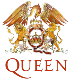 You can imagine a Mexican eagle, wings outstretched, over all clutching a pair of maple leaves. Also, dolphins (Alizée's favorite) supporting (rather in the positions of the lions in the Queen "crest") and also the traditional title given to the heir apparent to the throne of France (  ). Anyway just an idea for continuation of this project (but really a separate one) ). Anyway just an idea for continuation of this project (but really a separate one)
__________________
C'est ta faute... mais on t'aime quand même, Alizée!
Tu m'as pris dès le premier "moi." Last edited by CFHollister; 08-08-2009 at 03:21 AM..
|
 |
|
|


 Hybrid Mode
