|
#1
 12-18-2007, 09:39 AM
|
||||
|
||||
|
The discussion in the T-shirt threads got me thinking:
I think the site needs an "approved" logo and/or name. When I say logo, I'm thinking perhaps an AA in a staggered fashion with the first A bigger than the second, along with some guilding. Or if we want the logo to match a text version, a staggared AAm (this feeds back into the abbreviation for our site discussion we had previously). But I'm digressing, I don't want this thread to be list of suggested logos and names, but to discuss whether we even wish to pursue a logo/name idea at all. The name is more than just the words, but would include the font, kerning, size, etc. Why this? It's important to maintain a consistent image in the community. The whole purpose of a trade mark (whether it's called that or not), is it stays the same. It's OK to have more than one, but each must be explicitly defined and used appropriately. Look at Coke and Pepsi, for instance. They have their serif name and the sans serif name. Each serves a different purpose. In fact, this site already has a sans serif logo in the name on the main page. Perhaps we add a serif name with a bit of motion as another name (which can be used on site merchandise). One of the best ways to let your customers and the world know you are serious is to have a serious front you show to the world. A logo and name, consistently applied and repeated over and over, is how you do it. Minor changes over years are OK, as are tweaks for special occassions. Or, in the case of the real Alizée, to break with the past. That said, I guess the main guy to decide whether this should even be attempted is...Brad.
__________________

|
|
#2
12-18-2007, 10:05 AM
|
||||
|
||||
|
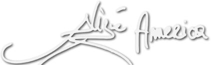
Actually, I started playing around with this a little. At least working on a unique "A" for the America part. The rest were pretty much the standard fancy fonts already in Windows or possibly a free one from www.dafont.com. Like you mentioned, I pictured the same look with the first "A" being larger than the second.
 As you've stated, it's really up to Brad if he wants one (we could only suggest). As you've stated, it's really up to Brad if he wants one (we could only suggest).BTW, I believe Brad used the Trebuchet MS font for the site header.
__________________
C'est pas ma faute, c'est ma passion pour la plus belle fille du monde !
img174.imageshack.us/img174/6863/tinkerbellyu5.gif  Youpidoo! I'm "foamely" ecstatic... So if you're okey dokey... Let's do boogie-woogie... Last edited by Sir Wood; 12-18-2007 at 01:15 PM..
|
|
#3
12-18-2007, 12:20 PM
|
||||
|
||||
|
It would be cool to see what what kind of approved logo and/or name we can come up with...Really it could have AA in it but it also could have more in it as well
__________________
|
|
#4
12-18-2007, 01:31 PM
|
||||
|
||||
|
Q: What is a camel ?
A: A horse designed by a committee. I'd love to help out on this, since this type of work is a large part of what I do for a living, but - as we've seen with the whole logo/shirt/promo stuff fiasco - it's almost certain to wind up being another "camel". I'll help if asked, but I've had my fill of camels for a while.
|
|
#6
12-18-2007, 05:06 PM
|
||||
|
||||
|
CAP, you're right about committees. However, committees are that way because of the need for consensus, or some function of majority (depending on the Charter and issue at hand). The result has to scratch the equity itch of enough members to make it work. Hence...the camel.
The nice thing about this particular decision is the site owner is the ultimate authority. No consensus. No majority. No super majority. No multiple equities to scratch. Just "So be it"! Dictatorial power does have its advantages in certain situations. Quote:
__________________
Last edited by OGRE; 12-18-2007 at 05:10 PM..
|
|
#7
12-18-2007, 05:27 PM
|
||||
|
||||
|
Ya know, Brad's got a point. The existing site logo definitely has a certain sophistication to it. It may not be reflective of Alizée's own tastes or the tastes of the BMG/RCA art department, but that's OK. Remember, we're "selling" a website, not necessarily Alizée herself. After all, THAT'S the function of the site content, true ?
|
|
#8
12-18-2007, 05:32 PM
|
||||
|
||||
|
I believe that a logo for the site would be greatly appreciated through out our little community. For one it lets us move on with the whole shirt idea and better show our appreciation for the site.
 Of course Brad should have the final say in the matter and something simple is a must. And as a side note does the America in "Alizée America" mean the States or the actual Americas... I mean since the site does represent pretty much a good chunk of the western hemisphere and not just the States. I think all this shirt and logo business needs its own section, like "Site design" or something... we have like four damn shirt threads and like two others just mentioning it. Of course Brad should have the final say in the matter and something simple is a must. And as a side note does the America in "Alizée America" mean the States or the actual Americas... I mean since the site does represent pretty much a good chunk of the western hemisphere and not just the States. I think all this shirt and logo business needs its own section, like "Site design" or something... we have like four damn shirt threads and like two others just mentioning it. 
__________________
  [9:59] [Solaris] here comes marik! [Alizée Bar and Grill]: marik has entered at 9:59 [9:59] [Bill Seals] OH shite [9:59] [Solaris] I TOLD YOU [9:59] [Chommpers] mind powers
|
|
#9
12-18-2007, 05:41 PM
|
||||
|
||||
|
typically when one says "america", you immediately think of the states. but of course america could mean, as you said, central and south america and even canada(the bastards). when one says "americans", you think of someone living in the US. when technically, someone living in brazil could be american. i guess we should change the site name to "Alizee United Statesians."
|
|
#10
12-18-2007, 05:42 PM
|
||||
|
||||
|
A logo does not necessarily need to have any real level of complexity to look great. For example, I made a logo for myself a while back (I don't use it for anything), simply using the Paris font of En Concert fame and joining the letters together with filled vector paths. I think that Alizée America would do well to have a logo, even such as this.
Edit: and Cooney Nurvonic, I resent that  
__________________

Last edited by espire; 12-18-2007 at 06:08 PM..
|
 |
|
|


 Linear Mode

